ISBN: 978-0-9839415-3-8
8.5 x 11 Inches, portrait, 360 FULL COLOR pages.
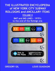
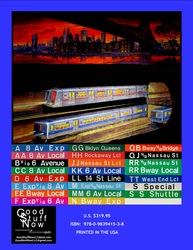
This book continues where Volume I ended. It begins with the BMT and IND Black & White upper and lower case readings and continues with all the color signs of the end of rollsigns in the early 21st Century.
By the late 1960’s the BMT Lines and IND lines were designated as Division “B”. The IRT Lines were designated Division “A”. (IRT signs will be covered in Volume III.) Originally, color signs bore colors of no particular significance. Eventually a color code was created based upon the Manhattan trunk line in which a particular route operated.
By the late 1970’s, the New York City Subway had plummeted into a dark dirty dismal era. Fare beaters, graffiti and just plain filth were commonplace in the New York City Subway. Maintenance was at an all time low with derailments and cars out of service on a daily basis.
The backbone of the BMT were the Standards and the D-Types. They were both retired by this time, the last D-Type in 1965 and the last of the Standard in 1969. The original cars of the IND, the R-1/9’s were retired in 1977 from regular passenger service.
Halvetica is a font that was developed for the purpose of standardizing signage. The New York City Subway began to use this font on the rollsigns as well as the station signage. It also introduced the use of upper and lower case letters. While it is true that the standardization of fonts was incorporated into Halvetica, the final product did not have the same order of appearance. Upper and lower case lettering is not as easy to read as block letters (capital letters). Additionally, the sizing of the individual letters within the same size is not standard. Spacing of the letters was not standardized as well as the centering of the signage itself. When you take a look at the signage for example of the R-16 Side Route Signs, it looks like a grade school student placed the letters to form the sign.

